Nothing takes the shine off a find quite like tilting a "seventeenth-century" map towards the window and spotting a neat grid of printer's dots. Reproductions have improved enormously, and they are cheap enough to turn up in auction lots, house clearances and online listings with depressing regularity. The consolation is that a genuine period sheet gives itself away in ways a desktop printer cannot fake. Here is what to examine, in order, with nothing more than decent daylight, a raking lamp and a magnifying glass.
Start with the paper
Paper is the first thing to judge, because it is the hardest thing to counterfeit convincingly. Genuine stock from the 1600s to the 1800s has a warm, slightly uneven tone — oatmeal, biscuit, soft grey — built up from the acid in the pulp and years of light exposure. The tone varies across the sheet, darker towards the edges, with the odd brown speck of foxing where moisture has met iron impurities in the pulp.
Modern reprint paper is usually either bright white or a flat, uniform cream. When a dealer or a seller has "aged" it artificially, the giveaway is evenness: the colour runs right to the very edge of the sheet, or sits in a tidemark that looks like a wash of cold tea. Turn the sheet over. On an original, the reverse is normally a shade paler than the front and carries the faint shadow of the printed image. A verso that is brilliantly clean and white beneath a supposedly 300-year-old image is worth a second look.
Hold the paper up to a strong light. Sheets made before the nineteenth century were usually laid paper, and you will see faint parallel chain lines about an inch apart, crossed by finer laid lines. Wove paper, smoother and without those lines, became common from the later 1700s. Genuine old paper also feels soft and slightly floppy, not stiff and glossy, and it rarely sits perfectly flat.
The plate mark: the single most useful clue
Copperplate engravings, etchings and mezzotints were printed on an intaglio press, which forced damp paper down into the inked grooves of the plate under heavy pressure. That pressure left a rectangular depression just outside the image border — the plate mark.
Find it by sighting across the sheet at a low angle in raking light, then confirm it with a fingertip. A real plate mark is soft, slightly rounded and a little uneven; the paper inside it is marginally thinner, and there is often a pale haze of plate tone where ink lingered. Fakes come in two main forms. The first is an embossed line pressed in with a die, which feels hard and mechanical and runs perfectly straight. The second is a printed shadow — a grey line designed to look like the impression of a plate, with no relief at all when you run a finger over it.
One caution: woodcuts, wood engravings and lithographs do not produce plate marks. Their absence proves nothing on its own, so judge those by the other tests here.
Margins, folds and what is on the back
Most surviving maps and prints were once bound into atlases, travel accounts or magazines. That history leaves evidence: a centre fold, small stab-stitch holes along one edge, a narrow stub where the sheet was tipped in, a plate number such as "Pl. 42" in the top corner, or a trimmed edge where a binder's knife went through. Faint offsetting on the reverse, from ink transferring to a facing page, is another good sign.
Reproductions tend to be suspiciously tidy. The margins are perfectly equal on all four sides, cut square, with no fold, no stitch holes and no trace of ever having lived inside a book. Look, too, for anachronisms: a barcode, an ISBN, a copyright line, "Printed in…", a modern sans-serif caption, or a small note admitting the sheet is a facsimile. Old mount burn — a rectangular tan line left by a mount or frame — is another reassuring mark of age, though its absence is not fatal.
Read the printing through a loupe
A jeweller's loupe of 8x to 10x magnification settles most arguments. Under it, a hand-cut engraving or etching shows crisp lines with slightly ragged, variable edges and cross-hatching that changes weight across the image. A wood engraving has fine, clean lines with no plate mark. A lithograph has a soft, even stone grain.
Digital output is different in kind. Flat areas break into halftone dots, often in the classic rosette pattern of four-colour printing. Inkjet reproductions show fine sprays of coloured speckles at the edges of lines and letters. Curves look stepped rather than smooth, and solid colour sits flat and lifeless where an old impression would show the slight unevenness of ink rolled onto a plate.
Hand-colour or printed colour?
Many period maps were coloured by hand, sometimes decades after printing. Watercolour sits on top of the printed lines as a translucent wash, its edges soft and slightly uneven, occasionally stopping short of a border or bleeding past it. Printed colour is either dotted or flat, and lines up obediently with the image beneath.
Then question the map itself
Paper and print will tell you how a sheet was made. The image tells you when. Check the publication line — the imprint along the bottom edge naming the publisher, place and date, often with the formula "Published as the Act directs". Look at the geography: coastlines drawn from guesswork, place names long since changed, a decorative cartouche that belongs to a particular era.
Bear in mind that not every old reproduction is modern. Nineteenth-century facsimiles of earlier maps exist, printed on genuinely old paper, and they are usually described as facsimiles by honest sellers. They are collectable in their own right, but they are not originals. Equally, perfect condition is not proof either way: some sheets survive remarkably well, and some reproductions arrive already torn.
A quick pre-purchase checklist
- Paper tone uneven, with soft variation and the odd foxing spot — or too uniform to be true?
- Plate mark present, soft and slightly irregular, with plate tone, if the method is intaglio?
- Margins unequal, with a fold, stub or stitch holes suggesting a former life in a book?
- Reverse showing show-through, offsetting or mount burn rather than blank white cleanliness?
- Lines crisp and variable under magnification, with no halftone dots or inkjet speckle?
- Hand-colouring translucent and slightly wayward rather than printed flat?
- Imprint, geography and typeface consistent with the date claimed?
- No barcode, ISBN, copyright line or modern caption anywhere on the sheet?
Buying with confidence
Ask direct questions before you commit. What printing method was used? What is the size of the sheet and of the plate mark? Can the seller send a photograph of the reverse taken in raking light? Good dealers will answer all of this without hesitation, because they have checked it themselves. Vague answers, or an unwillingness to show the back of a sheet, are answers in their own right.
Buy from sellers who describe paper and printing method in the listing rather than relying on the word "antique". Compare what you are being offered with the stock of established map and print dealers, and be sceptical of anything priced far below the going rate for comparable originals — that gap is usually the reproduction telling you what it is. And if a purchase is significant, or you are buying with resale in mind, take advice from a specialist dealer or auction house before parting with money. For anything you simply want to frame and enjoy, buy it as a decorative print, pay a decorative price, and you will never be disappointed.
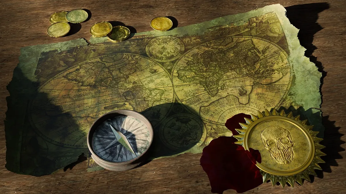
Photo: MasterTux / Pixabay